A business selling a download, a workshop and a service needs more than three attractive cards. Each card must explain a different purchase and lead to the correct product. A generic “Get started” button can hide important differences between immediate access, a scheduled event and work delivered later.
Whop's Blueprints guide describes generating a website through an AI chat and creating products and pricing alongside it. That makes a multi-offer brief useful: tell the builder which distinctions to preserve, then inspect what it actually configures. This guide focuses on several separate offers, not a guarantee that one prompt creates a working cart or bundle.
Disclosure: Dennis Hegstad is employed at Whop. AdsX may earn referral compensation when you sign up through our Whop partner link. This article uses public documentation; the example and prompts are original illustrations, not a tested merchant build.
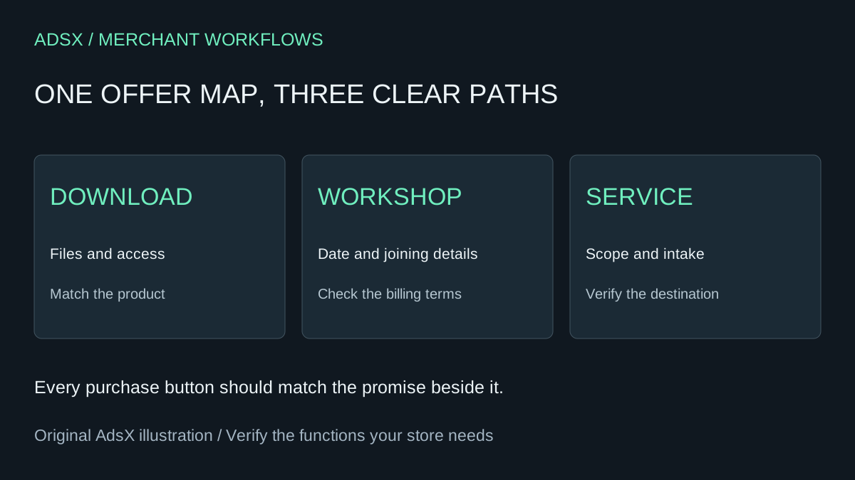
Original AdsX illustration.
Start with an offer map
Use stable working labels before writing sales copy. For example, a small education business might have three offers. The amounts and deliverables below are invented examples, not Whop fees or AdsX products.
| Offer label | What the buyer gets | Illustrative charge | Delivery requirement |
|---|---|---|---|
| Template pack | A defined set of downloadable worksheets | $29 USD once | Access to the stated files |
| Live workshop | One scheduled teaching session | $79 USD once | Date, time zone and joining instructions |
| Private review | Written feedback on one submitted project | $199 USD once | Intake and agreed turnaround |
Record an approved product and purchase destination for each label once configured. Keep those account identifiers in your private working brief; customers need readable offer names, not internal IDs. If the business does not yet know the workshop date or service scope, resolve that before publishing a purchase promise.
Multiple prices for the same product are not automatically the same thing as separate products. Whop's product documentation supports pricing choices and specifies which apps or content members receive. Review the actual access configuration. Buying the template pack should not accidentally grant the private review unless that is the approved offer.
Prompt the structure before visual polish
Use this as an initial brief, replacing every placeholder:
Build a website for [business] with these separate offers: [approved offer map]. Give each offer a clear name, scope, billing description and specific purchase action. Create a comparison section that helps a visitor choose by need, without inventing a “best value” claim. Preserve the supplied prices, currencies and billing types. Do not create a bundle, subscription or additional product unless I request it. Ask about missing dates or delivery terms. For my review, list each visible purchase button and its intended product and destination. Mark anything you could not configure or inspect.
This is an untested prompt. The returned explanation is not proof that every button uses the right destination. A builder may create a convincing preview while leaving a product setting incomplete. Review the website and the product configuration separately.
For a business with only one offer, use the simpler Whop AI offer brief. Adding more offers solely to fill a pricing grid creates unnecessary decisions for visitors and more settings for the merchant to maintain.
Make the navigation reflect customer intent
The template buyer may want an immediate, self-directed resource. The workshop buyer needs the schedule. The service buyer needs to understand what they must submit and what happens next. Give each path the facts needed to make that decision before the purchase action.
A useful comparison could use columns for delivery format, prerequisites and support included. Avoid a row of generic checkmarks that implies the offers are interchangeable. Do not label a one-time service “monthly” because a pricing-table template defaults to subscriptions.
If separate detail pages are created, open them directly as well as through the homepage. Confirm that navigation back to the offer list is understandable on a phone. Do not assume a generated page is reachable just because its title appears in the chat.
Review the purchase map
Create a checklist with one row for every purchase button, including repeated buttons near the footer. Record visible label, expected offer, observed destination and the billing summary shown there. Opening checkout is a destination check, not a completed-payment test.
Ask for a focused revision when you find a mismatch:
The [button label and page] should lead to [approved offer], but it currently leads to [observed destination]. Correct only this mapping and any identical misplaced links. Preserve prices, product access and the other offers. Report the pages changed and any destination you cannot verify. Do not replace all checkout links with one shared URL.
After the edit, recheck all three routes. A global component change can fix one button while changing the others. If payment or fulfillment checks are needed, use the supported authorized test process and record what was actually observed.
Launch with clear boundaries
Check phone layout, billing intervals, currencies, access, delivery instructions and any required intake. Off-platform fulfillment remains work the business must organize; a purchase button cannot deliver a promised review by itself. Keep the offer map with your revision notes so future changes have an agreed reference.
When Whop fits the business and the offer structure is ready, start building on Whop through AdsX’s partner link. For edits to an existing site, use the focused revision prompts and change one observed problem at a time.