Before launching an AI-built storefront, try reaching its offer and purchase link without a mouse. A menu that looks polished may still be hard to open, leave or understand from a keyboard. Give Whop AI a concrete observed problem to fix rather than a broad instruction to “make it accessible.”
Whop's website-building guide documents chat-based creation and later editing. The prompts below are suggested briefs for that workflow. They have not been executed in a merchant account, and this article does not claim that a Whop website has passed an accessibility audit.
Disclosure: Dennis Hegstad is employed at Whop. AdsX may earn commissions from qualifying referrals through its partner link. Assess the platform and the resulting website against your actual customer needs.
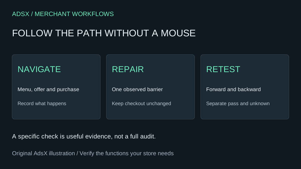
Original AdsX illustration.
Choose one complete customer path
Start with a task such as finding a workshop, reading its details and opening the correct checkout. Include the header menu, any offer selector and the purchase link. Stop before submitting a payment in a live environment; completing a charged transaction is not necessary to inspect navigation.
Write the intended route in plain language. For example: homepage → workshop details → pricing → purchase destination. Use the actual pages your business has, not placeholder routes suggested by a model. The multi-offer guide helps distinguish destinations when several products share a website.
Check what the keyboard actually does
W3C's keyboard guidance explains the importance of operating functionality through a keyboard interface. Use Tab to move forward and Shift+Tab to move back. Use Enter for links and the appropriate keyboard controls for buttons and menus. Watch whether the focused control remains visible and whether you can leave an opened component.
Record the page, control, key used and observed outcome. Do not infer a pass from the presence of a button label in HTML. A control can be labeled yet fail to open, move focus unexpectedly or trap the user.
| Check | Useful observation | Insufficient evidence |
|---|---|---|
| Header navigation | Menu opens and its links can be reached | Menu looks correct in a screenshot |
| Focus | Current control has a visible indicator | A CSS rule exists somewhere |
| Offer selection | Intended option can be chosen and identified | Mouse click works |
| Purchase route | Link opens the intended product destination | Button says Buy now |
These are suggested checks, not observed results from a tested storefront.
Ask for a targeted repair
On [page], keyboard testing found [exact observed behavior]. Expected behavior is [specific result]. Inspect the relevant component and propose the smallest repair. Prefer native links for navigation and buttons for actions. Preserve readable labels, visible focus and a logical navigation order. Do not change product names, prices, checkout destinations or other sections. Explain what changed and provide a keyboard retest sequence. Do not claim the whole website is accessible or compliant from this repair.
Supply the original sequence: for example, “Tab reaches the menu button; Enter opens it; the next Tab jumps behind the menu.” That is more actionable than “navigation is broken.” Avoid inventing an error just to obtain a more elaborate response.
If the builder cannot inspect the relevant component, ask it to identify that limit. A proposal based only on a screenshot should not be presented as a verified implementation. Save the previous state through the workflow available to your account, and keep a record of the requested change.
Retest the whole path after a local fix
Repeat the original failing sequence, then test moving backward, closing the menu and continuing to the offer. Check at narrow and wide viewport widths because navigation may change between them. A successful header repair should not make the purchase link unreachable.
Open the purchase destination and confirm the product and price still match the approved offer. Treat hosted checkout as a separate surface: a website edit does not prove that every downstream interaction changed or passed. Record anything you cannot inspect rather than guessing.
For a support route, follow the same discipline using the customer-support page brief. Customers need to reach help as well as the sales action.
Use a simple evidence log
Keep one row per check with the page, browser, viewport, steps, expected result, actual result and date. Label states as passed, failed or not checked. Include the revision associated with a successful retest so a later redesign does not inherit an outdated pass.
W3C's Easy Checks introduces preliminary accessibility review. A small keyboard exercise is useful, but it is not a complete evaluation of contrast, screen-reader use, forms, content or every customer journey. Bring in appropriate expertise when the site or requirements need broader assessment.
Make this part of publishing, not a one-time promise
Add the chosen customer path to your launch checklist and repeat it after navigation changes. Keep repair requests specific, retain real evidence and avoid a public “fully accessible” claim based on an assistant's summary.
If the platform fits the business, start building on Whop through AdsX's partner link. Use the same clear brief for both the offer and the way a customer reaches it. A working path matters more than a reassuring sentence in the generation response.